Watch These Two Market Indicators
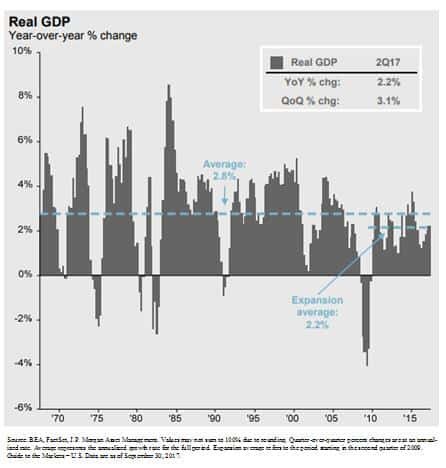
While a roaring economy typically rewards equity investors, the GDP growth rate in the U.S. has continued to grow at that same 2.2% pace that we have seen since the recovery began in March 2009. When you compare that to the GDP growth rates of past economic expansions, some may classify the current growth rate as “sub par”. As in the tale of the tortoise and the hare, sometimes slow and steady wins the race.
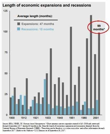
The number one questions on investor’s minds: “It’s been a great rally but are we close to the end?” Referencing the chart below, if you look at the length of the current economic expansion, going back to 1900 we are now witnessing the 3rd longest economic expansion on record which is making investors nervous because as we all know that markets work in cycles.
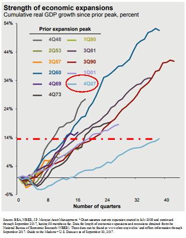
However, if you ignore the “length” of the rally for a moment and look at the “magnitude” of the rally it would seem that total GDP growth of the current economic expansion has been relatively tame compared to some of the economic recoveries in the past. See the chart below. The chart shows evidence that there have been economic rallies in the past that were shorter in duration but greater in magnitude. This may indicate that we still have further to go in the current economic expansion.
What causes big rallies to end?
Looking back at strong economic rallies in the past, the rallies did not die of old age but rather there was an event that triggered the next recession. So we have to be able identify trends within the economic data that would suggest that the economic expansion has ended and it will lead to the next recession.
Watch these two indicators
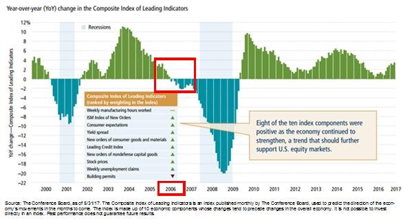
Two of the main indicators that we monitor to determine where we are in the current economic cycle are the Leading Indicators Index and the Yield Curve. History rarely repeats itself but it does rhyme. Look at the chart of the leading indicators index below. The leading indicators index is comprised of multiple economic indicators that are considered “forward looking”, like housing permits. If there are a lot of housing permits being issues, then demand for housing must be strong, and a strong housing market could lead to further economic growth. Look specifically at 2006. The leading indicators went negative in 2006, over a year before the stock market peaked in 2007. This indicator was telling us there was a problem before a majority of investors realized that we were on the doorstep of the recession.
Let’s look at the second key indicator, the yield curve. You will hear a lot about the “slope of the yield curve” in the media. In a healthy economy, long term interest rates are typically higher than short term rates which results in a “positively slopped” yield curve. In other words, when you go to the bank and you have the choice of buying a 2 year CD or a 10 year CD, you would expect to receive a higher interest rate on the 10 year CD because they are locking up your money for 10 years instead of 2.
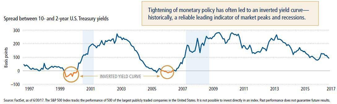
There are periods of time where the interest rate on a 10 year government bond will drop below the interest rate on a 2 year government bond which is considered an “inverted yield curve”. Why does this happen and why would investors by that 10 year bond that is yielding less than the 2 year bond? This happens because bond investors are predicting an economic slowdown in the foreseeable future. They want to lock in the current 10 year interest rate knowing that if the economy goes into a recession that the Fed may begin to lower the Fed Funds Rate which has a more rapid impact on short term rates. It’s a bet that the 2 year bond rate will drop below the 10 year bond rate within the next few years.
If you look at the historical chart of the yield curve above, the yield curve inverted prior to the recession in the early 2000’s and prior to the 2008 recession.
Looking at where we sit today, within the last 6 months the leading indicators index has not only been positive but it’s accelerating and the yield curve is still positively sloped. While we realize that there is not a single indicator that accurately predicts the end of a market cycle, these particular economic indicators have historically been helpful in predicting danger ahead.
There will always be uncertainty in the world. Currently it has taken the form of U.S, politics, tax reforms, geopolitical events, and global monetary policy but it would seem that based on the hard economic data here in the U.S. that our economic expansion that began in March 2009 may still have further to go.

About Michael.........
Hi, I’m Michael Ruger. I’m the managing partner of Greenbush Financial Group and the creator of the nationally recognized Money Smart Board blog . I created the blog because there are a lot of events in life that require important financial decisions. The goal is to help our readers avoid big financial missteps, discover financial solutions that they were not aware of, and to optimize their financial future.