Patience Should Reward Investors In 2018
Bottom line, the first half of 2018 was a tough pill to swallow for investors. They had to fight a constant rollercoaster. Volatility was high, returns were low, and the news was dominated with fears of trade wars. This environment has left investors questioning if we are on the eve of the next recession. Well I have good news. While trade wars have driven

Bottom line, the first half of 2018 was a tough pill to swallow for investors. They had to fight a constant rollercoaster. Volatility was high, returns were low, and the news was dominated with fears of trade wars. This environment has left investors questioning if we are on the eve of the next recession. Well I have good news. While trade wars have driven fear into the hearts of investors, during that same time period corporate earnings have been soaring and the U.S. economy has continued its growth path. For these reasons, disciplined investors may have good things waiting for them in the second half of 2018.
Coming Off A Big Year
As of the end of the second quarter, the S&P 500 Index was up 2.6% year to date. So why does 2018 seem like such a disappointment? You have to remember that 2017 was a huge year with the added benefit of very little volatility. It was a straight march up the entire year.
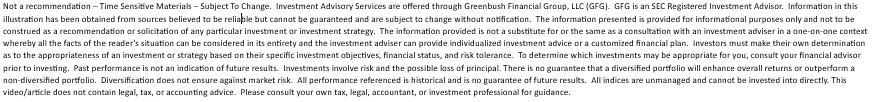
First, let’s compare the performance of the various asset classes in the first half of 2017 versus to first half of 2018. Below are the returns for the various assets classes in the first half of 2017:
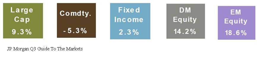
Here are those same asset classes in the first half of 2018.
Obviously a huge difference. At this time last year, the S&P 500 Index was already up 9.3% for the year compared to 2.6% in 2018. International and emerging market equities were up over 14% in the first half of 2017. In 2018, those same international stocks were down over 2%. One might guess that bonds would preform better in a year with muted stock returns. Well, one would be wrong because the Barclay’s US Aggregate Bond Index was down 1.6% in the first 6 months of 2018.
Volatility Is Back
Not only has the first half of 2018 been a return drought but the level of volatility in the stock market has also spiked. In the first 6 months of 2017, the S&P 500 Index only had 2 trading days where the stock market moved plus or minus by more than 1% in a day. Guess how many trading days there were in the first half of 2018 where the S&P 500 Index moved up or down by more than 1% in a day.
The answer: 25 Days
That’s a 1,250% increase over 2017. No wonder everyone’s nerves are rattled. So the up 2% YTD in the stock market feels more like a down 10% because a lot has happened in a short period of time. Plus, the only big positive month for the stock market was in January which feels like forever ago.
Recency Bias
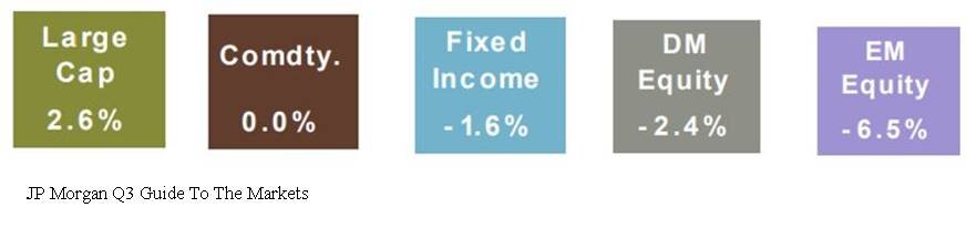
Investors are largely suffering for what we call in the investment industry as “recency bias”. In other words, what happened recently has now become the rule in the minds of investors. Investors are largely using 2017 as their measuring stick for 2018 performance and volatility. While it would seem that the dramatic increase in the level of volatility this year would classify 2018 as an abnormally volatile year, it’s actually 2017 that was the anomaly. Below is a chart that shows the annual return of the S&P 500 Index since 1980. The dots below each annual return are the market corrections that took place as some point during each calendar year.
Based on historical data, it’s “normal” for the market to experience on average a 10% correction at some point during the year. Now look at 2017, the stock market was up 19% for the year but the largest correction during the year was 3%. That’s abnormal. By comparison, even though we are only half way through 2018, we have already experienced a 10% correction and as of June 30th, the S&P 500 Index is up 2% for the year.
Earnings Are King
Behind the dark clouds of the media headlines and the increased level of volatility this year is the dramatic increase in corporate earnings. Corporate earnings have not only increased but they have leaped forward. Take a look at the chart below:
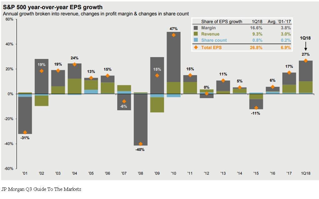
The market traditionally follows earnings. The earnings per share for the S&P 500 Index in 2017 was 17% which is a strong number historically. In the first quarterly of 2018, the year-over-year earnings per share growth was up 27%. That is a surge in corporate earnings. But you would have no idea looking at the meager 2% YTD return from the stock market this year. Pair that with the fact that the P/E of the S&P 500 is around 16 which is in line with its 20 year historic average. See the chart below:
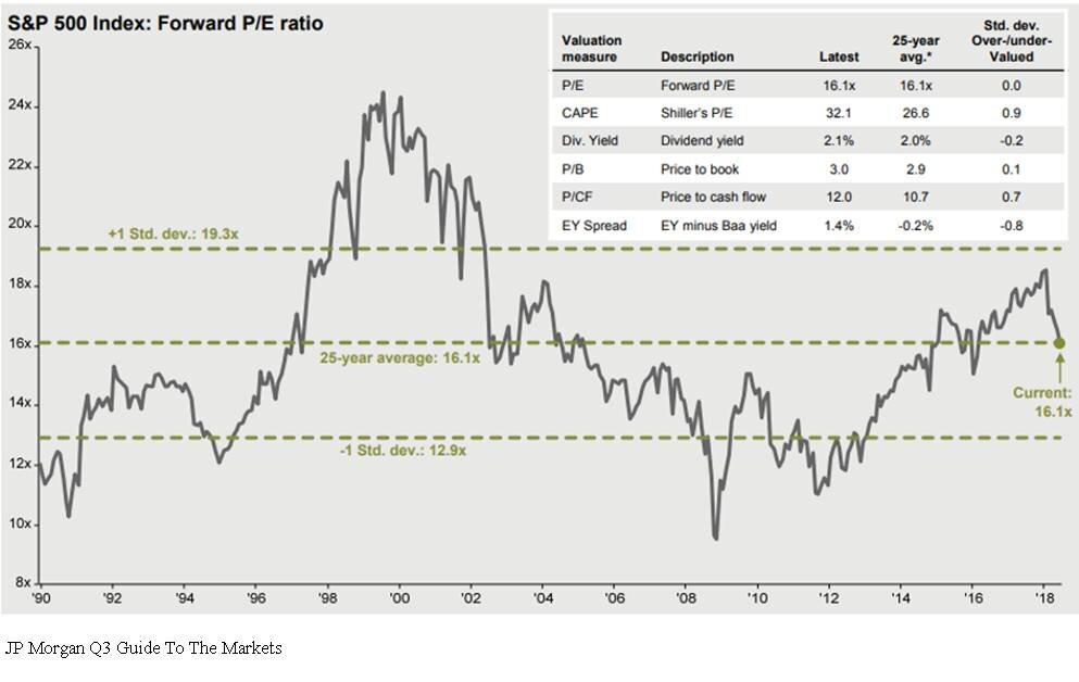
Even though it has been a long expansion, the market is not “over priced” by historic terms. If the stock market is fairly valued and corporate earnings are accelerating, one could make the case that the stock market has some catching up to do in the second half of the year.
The Chances Of A Recession Are Low
With the yield curve still positively sloped and the Composite Index of Leading Indicator, not only positive, but accelerating, a recession within the next 6 to 12 months seems unlikely. It’s like wandering through a jungle. When you are on the ground, the jungle is intimidating, there are plenty of things to be afraid of, and it’s tough to know which direction you should be walking. As investment advisors it’s our job to climb the tallest tree to get above the jungle to determine which way we should be walking.
In summary, 2018 has been an emotional roller coaster for investors. But making sound investment decision is about putting your emotions and gut feelings aside and looking at the hard economic data when making investment decisions. That data is telling us that we may very well be witnessing the soon to be longest economic expansion since 1900. The U.S. economy is strong, tax reform is boosting corporate earnings, interest rates are rising but are still at benign levels, and consumer sentiment is booming. In the later stages of an economic cycle, higher levels of volatility will be here to stay which will test the patience of investors. But overall the second half of the year could prove to be beneficial for investors that choose to climb the trees.

About Michael.........
Hi, I’m Michael Ruger. I’m the managing partner of Greenbush Financial Group and the creator of the nationally recognized Money Smart Board blog . I created the blog because there are a lot of events in life that require important financial decisions. The goal is to help our readers avoid big financial missteps, discover financial solutions that they were not aware of, and to optimize their financial future.


We Are Sleep Walking Into The Next Crisis
The U.S. economy is headed down a dangerous path. In our opinion it has nothing to do with the length of the current economic cycle, valuations, interest rates, or trade wars. Instead, it has everything to do with our mounting government deficits. We have been talking about the federal budget deficits for the past ten years but when does that

The U.S. economy is headed down a dangerous path. In our opinion it has nothing to do with the length of the current economic cycle, valuations, interest rates, or trade wars. Instead, it has everything to do with our mounting government deficits. We have been talking about the federal budget deficits for the past ten years but when does that problem really come home to roost?
A Crisis In Plain Sight
An economic crisis is often easier to spot than you think if you are looking in the right places. Most of the time it involves identifying a wide spread trend that has evolved in the financial markets and the economy, shutting out all of the noise, and then applying some common sense. Looking at the tech bubble, people were taking home equity loans to buy tech stocks that they themselves did not understand. During the housing bubble people that were making $40,000 per year were buying homes for $500,000 and banks were giving loans with no verification of income. Both of the last two recessions you could have spotted by paying attention to the trends and applying some common sense.
Government Debt
Looking at the data, we think there is a good chance that the next economic crisis may stem from reaching unsustainable levels of government debt. Up until now we have just been talking about it but my goal with this article is to put where we are now in perspective and why this "talking point" may soon become a reality.
Debt vs GDP
The primary measuring stick that we use to measure the sustainability of the U.S. debt level is the Debt vs GDP ratio. This ratio compares the total debt of the U.S. versus how much the U.S. economy produces in one year. Think of it as an individual. If I told you that someone has $100,000 in credit card debt, your initial reaction may be “wow, that’s a lot of debt”. But then what if I told you that an individual makes $1,000,000 per year in income? That level of debt is probably sustainable for that person since it’s only 10% of their gross earnings, whereas that amount of credit card debt would render someone who makes $50,000 per year bankrupt.
Our total gross federal deficit just eclipsed $21 trillion dollars. That’s Trillion with a “T”. From January through March 2018, GDP in the U.S. was running at an annual rate of $19.965 trillion dollars (Source: The Balance). Based on the 2018 Q1 data our debt vs GDP ratio is approximately 105%. That’s big number.
The Safe Zone
Before I start throwing more percentages at you let's first establish a baseline for what's sustainable and not sustainable from a debt standpoint. Two Harvard professors, Reinhart and Rogoff, conducted a massive study on this exact topic and wrote a whitepaper titled "Growth in a Time of Debt". Their study aimed to answer the question "how much debt is too much for a government to sustain?" They looked at historic data, not just for the U.S. but also for other countries around the world, to determine the correlation between various levels of Debt vs GDP and the corresponding growth or contraction rate of that economy. What they found was that in many cases, once a government's Debt vs GDP ratio exceeded 90%, it was frequently followed by a period of either muted growth or economic contraction. It makes sense. Even though the economy may still be growing, if you are paying more in interest on your debt then you are making, it puts you in a bad place.
Only One Time In History
There has only been one other time in U.S. history that the Debt vs GDP ratio has been as high as it is now and that was during World War II. Back in 1946, the Debt vs GDP ratio hit 119%. The difference between now and then is we are not currently funding a world war. I make that point because wars end and when they end the spending drops off dramatically. Between 1946 and 1952, the Debt vs GDP ratio dropped from 119% to 72%. Our Debt vs GDP ratio bottomed in 1981 at 31%. Since then it has been a straight march up to the levels that were are at now. We are not currently financing a world war and there is not a single expenditure that we can point to that will all of a sudden drop off to help us reduce our debt level.
Spending Too Much
So what is the United States spending the money on? Below is a snapshot of the 2018 federal budget which answers that question. As illustrated by the spending bar on the left, we are estimated to spend $4.1 trillion dollars in 2018. The largest pieces coming from Social Security, Medicare, and Medicaid.
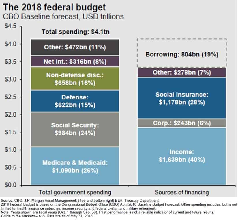
federal deficit
The bar on the right illustrates how the U.S. intends to pay for that $4.1 trillion in spending. At the top of that bar you will see “Borrowing $804 Bn”. That means the Congressional Budget Office estimates that the U.S. will have to borrow an additional $804 billion dollars just to meet the planned spending for 2018. With the introduction of tax reform and the infrastructure spending, the annual spending amount is expected to increase over the next ten years.
Whether you are for or against tax reform, it’s difficult to make the argument that it’s going to “pay for itself in the form of more tax as a result of greater economic growth.” Just run the numbers. If our annual GDP is $19.9 Trillion per year, our 3% GDP growth rate I already factored into the budget numbers, to bridge the $804B shortfall, our GDP growth rate would have to be around 7% per year to prevent further additions to the total government debt. Good luck with that. A 7% GDP growth rate is a generous rate at the beginning of an economic expansion. Given that we are currently in the second longest economic expansion of all time, it’s difficult to make the argument that we are going to see GDP growth rates that are typically associated with the beginning of an expansion period.
Apply Common Sense
Here’s where we apply common sense to the debt situation. Excluding the financing of a world war, the United State is currently at a level of debt that has never been obtained in history. Like running a business, there are only two ways to dig yourself out of debt. Cut spending or increase revenue. While tax reform may increase revenue in the form of economic growth, it does not seem likely that the U.S. economy is at this stage in the economic cycle and be able to obtain the GDP growth rate needed to prevent a further increase in the government deficits.
A cut in spending, in its simplest form, means that something has to be taken away. No one wants to hear that. The Republican and Democratic parties seem so deeply entrenched in their own camps that it will make it difficult, if not impossible, for any type of spending reform to take place before we are on the eve of what would seem to be a collision course with the debt wall. Over the past two decades, the easy solution has been to “just borrow more” which makes the landing even harder when we get there.
Answering the “when” question is probably the most difficult. We are clearly beyond what history has revered as the “comfort zone” when to comes to our Debt vs GDP ratio. However, the combination of the economic boost from tax reform and infrastructure spending in the U.S., the accelerating economic expansion that is happening outside of the U.S., and the low global interest rate environment, could continue to support growth rates even at these elevated levels of government debt.
Debt is tricky. There are times when it can be smart accept the debt, and times where it isn’t helpful. As we know from the not too distant past, it has the ability to sustain growth for an unnaturally long period of time but when the music stops it gets ugly very quickly. I’m not yelling that the sky is falling and everyone needs to go to cash tomorrow. But now is a good time to evaluate where you are risk wise within your portfolio and begin having the discussion with your investment advisor as to what an exit plan may look like if the U.S. debt levels become unsustainable and it triggers a recession within the next five years.
About Michael.........
Hi, I’m Michael Ruger. I’m the managing partner of Greenbush Financial Group and the creator of the nationally recognized Money Smart Board blog . I created the blog because there are a lot of events in life that require important financial decisions. The goal is to help our readers avoid big financial missteps, discover financial solutions that they were not aware of, and to optimize their financial future.

What Does Tax Reform Mean For The Markets In 2018?
2017 ended up being a huge year for the U.S. stock market. The rally in the stock market was unmistakably driven by the anticipated passing of tax reform and Congress delivered. However, the sheer magnitude of the stock market rally has presented investors with a moment of pause and a lot of unanswered questions as we enter into the first quarter

2017 ended up being a huge year for the U.S. stock market. The rally in the stock market was unmistakably driven by the anticipated passing of tax reform and Congress delivered. However, the sheer magnitude of the stock market rally has presented investors with a moment of pause and a lot of unanswered questions as we enter into the first quarter of 2018. The two main questions being:
What does tax reform mean for the markets in 2018?
We are now in the second longest economic expansion of ALL TIME!!! I know what goes up, eventually comes down. Are we overdue for a major correction in the stock market?
Without a crystal ball, no one knows for sure. However, the purpose of this article is to identify indicators in the economy and the financial markets that may help us gauge the direction of the U.S. economy and equity markets as we progress through 2018.
Tax Reform: Uncharted Waters
While tax reform is a welcome friend for corporate America, we have to acknowledge that this also puts us in uncharted waters. Looking back, there has never been a time in history where the U.S. has injected fiscal stimulus (tax reform) into an economy that is already healthy. The last major tax reform was in the early 1980’s when the U.S. economy was trying to dig itself out of the long 1970’s recession.
When the economy is in a recession, the U.S. can either inject fiscal stimulus or monetary stimulus to get the economy growing again. The U.S. used monetary stimulus to dig us out of the Great Recession of 2008 – 2009. They lowered interest rates to basically 0%, pumped cash into the economy in the form of bond buying, and provided a financial back stop for the U.S. banking system.
These economic stimulus tools are similar to the concept of giving a patient in a hospital a shot of adrenaline. If a patient is flat lining, it provides that patient with a huge surge of energy. The patient’s body goes from 0% to 60%+ in under a minute. So what happens when you give someone who is completely healthy a shot of adrenaline? Do they go from 100% to 110%? My point is a healthy patient does not go from 100% to 160%. Both patients get a boost but the boost to the healthy patient is much lower as a percentage of where they started.
While we have never given the U.S. economy an adrenaline shot after a long economic expansion, I think it’s reasonable to apply the same general concept as our two hospital patients. Tax reform may very well lead to another year of positive returns for the stock market in 2018 but I think it’s very important for investors to set a reasonable expectation of return for the U.S. equity markets given the fact that we are injecting growth into an economy that is already at “full employment”.
Not Enough Workers
One of the greatest challenges that the U.S. economy may face in 2018 is a shortage of qualified workers. Prior to tax reform being passed, companies both large and small, have had plenty of job openings but have not been able to find the employees with the skills necessary to fill those positions.
For example, if Apple had 1000 job openings in November 2017 just to meet the current demand for their goods and services but in 2018, due to tax reform, consumers have more money to spend, and the demand for Apple products increases further, Apple may need to find another 2000 employee to meet the increase in demand. They are having trouble now finding the 1000 employees to meet their current demand, how are they going to find another 2000 quick enough in 2018 to meet the increase in demand? If they can’t make the phones, they can’t sell the phones. Fewer sales equals less revenue, which equals less net profit, which may lead to a lower appreciation rate of the stock price. For disclosure purposes, I’m not picking on Apple. I’m just highlighting an issue that may be common among the companies that make up the S&P 500 Index if tax reform leads to a spike in demand in 2018. If Wall Street is expecting accelerated earnings, how are the companies expected to deliver those enhanced earnings without the employees that they need to increase supply?
The unemployment rate in the U.S. is currently 4.1%. You have to go all the way back to the late 1960’s to find an employment rate below 4%. So we are essentially at “full employment”.
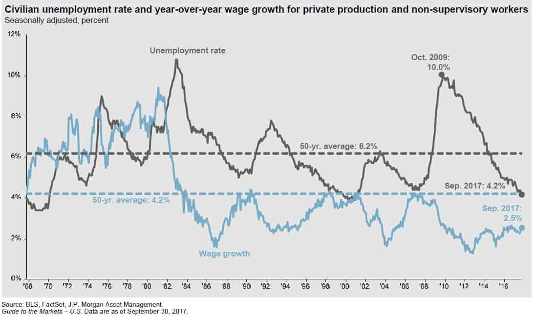
Rising Wages
The blue line in the chart above is also very important. The blue line represents wage growth. This answers the question: "Are people making more for doing the same amount of work?" If you look back historically on the chart, when the unemployment rate was falling, typically wage growth was increasing. It makes sense. When the economy is good and the job market is healthy, companies have to pay their employees more to keep them. Otherwise they will go work for a competitor, who has 10 job openings, and they get paid more. Wage growth is good for employees but it's bad for companies. For companies, employee wages are usually their largest expense. If you increase wages, you are increasing expenses, which decreases profits. Lower profits typically results in lower stock prices. Companies in 2017 had the luxury of strong demand but limited wage growth. My guess is you will begin to see meaningful wage growth in 2018 as companies see an increase in demand as a result of tax reform and end up having to raise wages to retain and attract employees. This is just another reason why 2018 may be a good year for the stock market but not a great one.
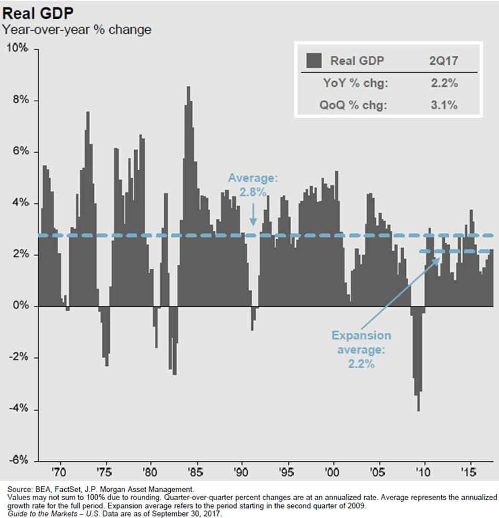
What Fuels GDP Growth?
Gross Domestic Product ("GDP") is the economic indicator that is used to measure how much the U.S. economy produces in a year. It's how we gauge whether our economy is growing or contracting. Since March 2009, the GDP growth rate has averaged about 2.2% per year. This is subpar by historic standards. In most economic expansions, GDP is growing at an annual rate of 4%+.
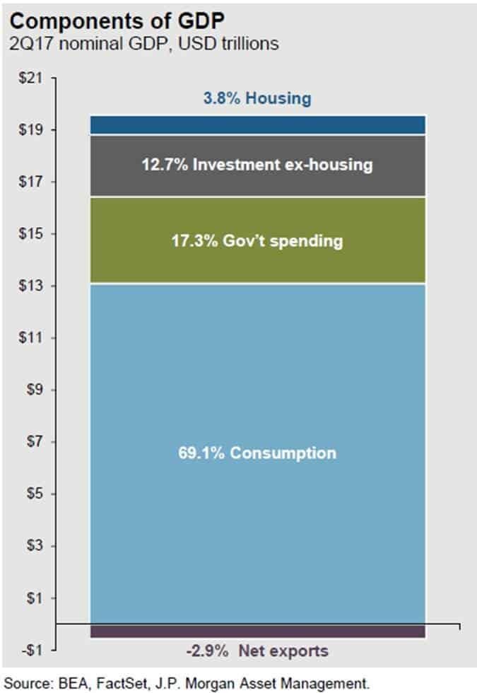
Before we get into what pieces of tax reform may help to increase the GDP growth rate, let us first look at what GDP is made of. Our GDP is comprised of 5 categories (for my fellow econ nerds that assign 4 categories to GDP, we split capital spending into two separate categories):
Consumption or "Consumer Spending" 69.1%
Government Spending (includes defense) 17.3%
Investment (ex-housing) – "Business Spending 12.7%
Housing 3.8%
Net Exports -2.9%
Consumer Spending (+)
Consumer spending which makes up 69.1% of our GDP should increase as a result of tax reform in 2018. In general, if people have more discretionary income, they will spend all or a portion of it. Tax reform will lower the tax bill, for not all, but many U.S. households, increasing their disposable income. Also, if we see an increase in wage growth in 2018, people will be taking home more in their paychecks, allowing them to spend more.
Dr James Kelly, the chief economist of JP Morgan, made a very interesting observation about the evolution of the tax bill. When the tax bills were in their proposed state, one for the Senate and a separate bill for the House, each bill to stay under the $1.5 Trillion 10 year debt cap reduced taxes by about $150 Billion dollars per year. 50% of the annual tax reduction was going to businesses with the other 50% going to individual tax payers.
In order to get the bill passed before the end of the year, Congress was forced to shift a larger proportion of the $150 billion in tax brakes per year to individual taxpayers. In the tax bill’s final form, Dr Kelly estimated that approximately 75% of the tax reductions were now being retained by individual taxpayers with only 25% going to businesses. With a larger proportion of the tax breaks going to individual taxpayers that could increase the amount of discretionary income available to the U.S. consumer.
Government Spending (Push)
The anticipated increase in government spending really stems from the Trump agenda that has been communicated. One of the items that he campaigned on was increasing government spending on infrastructure. At this point we do not have many details as to when the infrastructure spending will begin or how much will be spent. Whatever ends up happening, we are not forecasting a dramatic increase or decrease in government spending in 2018.
Investment - Business Spending (+)
Even though business spending only represents 12.7% of our GDP, we could see a sizable increase in spending by businesses in 2018 for the following reasons:
Corporate tax rate is reduced from 35% to 21%
The repatriation tax will allow companies to bring cash back from overseas at a low tax rate
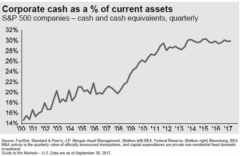
Prior to tax reform, companies already had historically high levels of cash on their balance sheet. What are they going to do with more cash? (See the chart below)
If having more cash was not a large enough incentive by itself for companies to spend money, the new tax rules allowing immediate expensing of the full cost of most assets purchased for the next five years should be. Under the current tax rules, when a business purchases a new piece of equipment, a fleet of trucks, office furniture, whatever it is, the IRS does not allow them to deduct 100% of purchase price in the year that they buy it. They have to follow a "depreciation schedule" and they can only realize a piece of that expense each year. The current tax rules put companies at a tax disadvantage because companies are always trying to shelter as much income as possible from taxation. If Company XYZ buys a piece of equipment that cost $1,000,000, the IRS may require Company XYZ to depreciate that expense over a 10 year period. Meaning they can only realize $100,000 in expenses each year over that 10 year period, even though they already paid the full $1,000,000 for that new piece of equipment.Under the new tax reform, if Company XYZ buys that same new piece of equipment for $1,000,000, they can deduct the full $1,000,000 expense against their income in 2018. Whoa!!! That's huge!! Yes it is and it's a big incentive for companies to spend money over the next five years.
Housing & Net Exports (Push)
We do not expect any significant change from either of these two categories and they represent the smallest portion of our total GDP.
Watch GDP In 2018
The GDP growth rate in 2018 may give us the first indication as to how many "extra innings" we have left in this already long bull market rally. If we do not see a meaningful acceleration in the annual growth rate of GDP above its 2.2% average rate, the rally could be very short lived. On the flip side, if due to tax reform consumer spending and business spending leaps forward in 2018 and 2019, we may be witnessing the longest economic expansion of all time. Time will tell.
Share Buybacks
You will undoubtedly hear a lot about “Share Buybacks” in 2018. Remember, U.S. corporations will most likely have piles of cash on their balance sheets. Instead of spending that money on hiring new employees, buying new equipment, or building a new plant, what else might they do with the cash? The answer, share buybacks.
If a public company like Nike has extra cash, they can go into the market, purchase their own stock, and then get rid of those outstanding shares. Basically it increases the earnings per share for the remaining shareholders.
Example: Let’s assume there are only 4 shares of Nike owned by 4 different people and Nike is worth $100,000. That means that each shareholder is entitled to 25% of that $100,000 or $25,000 each. Now because of tax reform, Nike has $50,000 of extra cash just sitting in its coffers that it otherwise would have paid to the government in taxes. Nike can go into the market with $50,000, purchase 2 shares back from 2 of the shareholders (assuming they would be willing to sell), and then “retire” those two outstanding shares. After that is done, there are 2 outstanding shares remaining but the value of Nike did not change. So the two remaining shareholders, without paying anything extra, now own 50% of Nike, and their shares are worth $50,000 each.
Share buyback may push stock prices higher from a simple math standpoint. If the formula is the value of the company divided by the number of shares outstanding, the fewer shares there are, assuming the value of the company stays the same, the price per share will go up. The incentive for these share buybacks will most likely be there in 2018. Not only will companies have the cash but share buybacks are a way that public companies can reward their current shareholders..
Is The Stock Market Too Expensive?
The P/E ratio of the S&P 500 Index is another barometer that investors will need to keep a close eye on in 2018. P/E ratios help us to answer the questions: “Is the stock market cheap, fairly valued, or expensive at this point?” The “Forward P/E Ratio” divides the price of a stock by the estimated future 12 months of earnings. The average Forward P/E ratio for the S&P 500 Index between December 1989 – September 30, 2017 was 16.0. As of December 22, 2017, the Forward P/E ratio of the S&P 500 Index is 19.99. In other words, it’s running at 25% above its 25 year historic average. See the chart below:
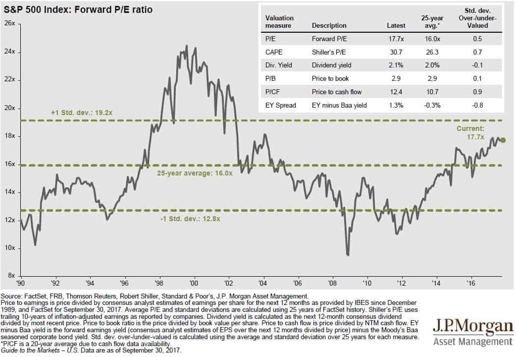
Conclusion, the U.S. stock market is not “cheap” and it’s a stretch to even classify it as “fairly valued”. I think we are well into what I would consider “expensive territory”. What does that mean for investors? You have to stay on your toes!!
Now, we have an anomaly in the mix with tax reform and history does not speak to how this could play out. If tax reform leads to an acceleration in corporate earnings, that in turn could slow the steady climb in the P/E ratio of the S&P 500 because earnings are the denominator in the formula. If stock prices and earnings are accelerating at the same pace, the stock market can go up without a further acceleration of the P/E ratio. Thus, keeping the stock market from becoming more overpriced and further increasing the risk of owning stocks in the S&P 500.
Summary
In 2018, investors should keep a close eye on the U.S. GDP growth rate, the level of spending by corporations and consumers, the volume of share buybacks by U.S. companies, and the P/E ratio of the S&P 500 Index.
About Michael.........
Hi, I’m Michael Ruger. I’m the managing partner of Greenbush Financial Group and the creator of the nationally recognized Money Smart Board blog . I created the blog because there are a lot of events in life that require important financial decisions. The goal is to help our readers avoid big financial missteps, discover financial solutions that they were not aware of, and to optimize their financial future.

Watch These Two Market Indicators
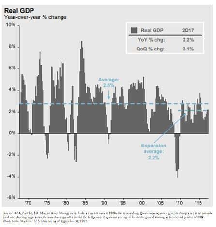
While a roaring economy typically rewards equity investors, the GDP growth rate in the U.S. has continued to grow at that same 2.2% pace that we have seen since the recovery began in March 2009. When you compare that to the GDP growth rates of past economic expansions, some may classify the current growth rate as “sub par”. As in the tale of the
While a roaring economy typically rewards equity investors, the GDP growth rate in the U.S. has continued to grow at that same 2.2% pace that we have seen since the recovery began in March 2009. When you compare that to the GDP growth rates of past economic expansions, some may classify the current growth rate as “sub par”. As in the tale of the tortoise and the hare, sometimes slow and steady wins the race.
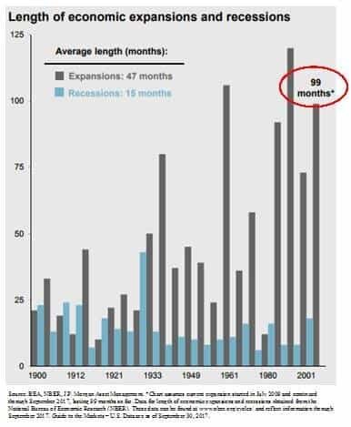
The number one questions on investor’s minds: “It’s been a great rally but are we close to the end?” Referencing the chart below, if you look at the length of the current economic expansion, going back to 1900 we are now witnessing the 3rd longest economic expansion on record which is making investors nervous because as we all know that markets work in cycles.
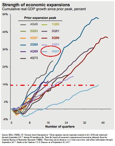
However, if you ignore the “length” of the rally for a moment and look at the “magnitude” of the rally it would seem that total GDP growth of the current economic expansion has been relatively tame compared to some of the economic recoveries in the past. See the chart below. The chart shows evidence that there have been economic rallies in the past that were shorter in duration but greater in magnitude. This may indicate that we still have further to go in the current economic expansion.
What causes big rallies to end?
Looking back at strong economic rallies in the past, the rallies did not die of old age but rather there was an event that triggered the next recession. So we have to be able identify trends within the economic data that would suggest that the economic expansion has ended and it will lead to the next recession.
Watch these two indicators
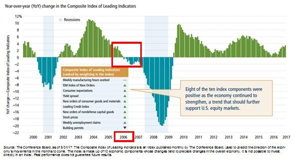
Two of the main indicators that we monitor to determine where we are in the current economic cycle are the Leading Indicators Index and the Yield Curve. History rarely repeats itself but it does rhyme. Look at the chart of the leading indicators index below. The leading indicators index is comprised of multiple economic indicators that are considered “forward looking”, like housing permits. If there are a lot of housing permits being issues, then demand for housing must be strong, and a strong housing market could lead to further economic growth. Look specifically at 2006. The leading indicators went negative in 2006, over a year before the stock market peaked in 2007. This indicator was telling us there was a problem before a majority of investors realized that we were on the doorstep of the recession.
Let’s look at the second key indicator, the yield curve. You will hear a lot about the “slope of the yield curve” in the media. In a healthy economy, long term interest rates are typically higher than short term rates which results in a “positively slopped” yield curve. In other words, when you go to the bank and you have the choice of buying a 2 year CD or a 10 year CD, you would expect to receive a higher interest rate on the 10 year CD because they are locking up your money for 10 years instead of 2.
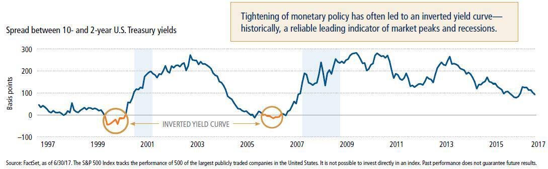
There are periods of time where the interest rate on a 10 year government bond will drop below the interest rate on a 2 year government bond which is considered an “inverted yield curve”. Why does this happen and why would investors by that 10 year bond that is yielding less than the 2 year bond? This happens because bond investors are predicting an economic slowdown in the foreseeable future. They want to lock in the current 10 year interest rate knowing that if the economy goes into a recession that the Fed may begin to lower the Fed Funds Rate which has a more rapid impact on short term rates. It’s a bet that the 2 year bond rate will drop below the 10 year bond rate within the next few years.
If you look at the historical chart of the yield curve above, the yield curve inverted prior to the recession in the early 2000’s and prior to the 2008 recession.
Looking at where we sit today, within the last 6 months the leading indicators index has not only been positive but it’s accelerating and the yield curve is still positively sloped. While we realize that there is not a single indicator that accurately predicts the end of a market cycle, these particular economic indicators have historically been helpful in predicting danger ahead.
There will always be uncertainty in the world. Currently it has taken the form of U.S, politics, tax reforms, geopolitical events, and global monetary policy but it would seem that based on the hard economic data here in the U.S. that our economic expansion that began in March 2009 may still have further to go.
About Michael.........
Hi, I’m Michael Ruger. I’m the managing partner of Greenbush Financial Group and the creator of the nationally recognized Money Smart Board blog . I created the blog because there are a lot of events in life that require important financial decisions. The goal is to help our readers avoid big financial missteps, discover financial solutions that they were not aware of, and to optimize their financial future.